
Charts are one of the best ways to show a concept to someone. They are a great form of visual communication because they show the trend or pattern in data, along with the data itself.
This means they show the proof behind the idea at the same time they are showing the idea. Since data visualizations are so good at showing ideas to someone, they can also be great to include in presentations.
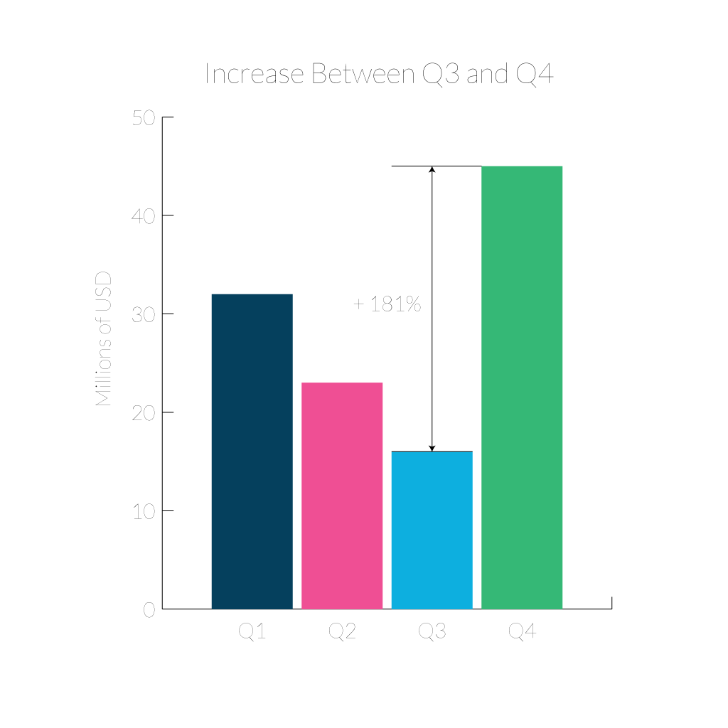
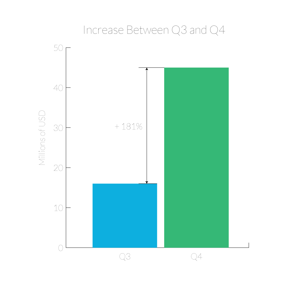
But the data visualization you used for analyzing your data isn’t the same chart you should put in your presentation. To begin with, the process of analysis and data exploration often involves creating many charts. Most of these charts probably won’t show anything significantly interesting, so they should never be used in a presentation. You should narrow down your selection of charts to just the few that convey an interesting point. The few charts that do show interesting information shouldn’t just be put into a presentation as-is though. Charts used in analysis and data exploration have a few differences from charts built for presentations. Exploratory charts don’t have any conclusions embedded in them anywhere, but presentation charts make a point. The axes labels, title, and legends aren’t just there to let the viewer draw their own conclusions like in an analysis chart. They all work together to help show the viewer the point that the presenter is trying to make. It is even a good idea to annotate the chart to point out the specific part you want your audience to focus on. Charts for presentations also shouldn’t show you the quantity of data points that you can get away with in a chart for analysis. Your audience is counting on you making your point easy to see and understand. Use responsible filtering to remove data that isn’t part of the point you are trying to make (but be sure the data you remove can be justified and wasn’t removed because it challenged your conclusion).
There’s also something to be said for not overwhelming your viewers with visual noise. It’s tempting to throw in every fancy axis, watermark, and dataset just because you can, but you end up getting this cluttered mess that no one outside your own analytics team can make sense of. Sometimes I’ll look at a slide and wonder if the person behind it just wanted a wallpaper. Take a step back and ask yourself if the story makes it through without all the bells and whistles, because odds are, trimming it back sharpens your point faster than adding anything would. Viewers appreciate breathing room, even in a data-heavy meeting.
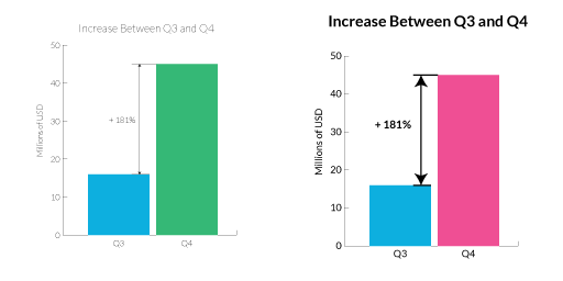
In addition to a chart in a presentation promoting a point of view, it should also be designed for the scale of presentations. That chart is going to be projected on a large screen (but far away from the audience). Projectors are notorious for reproducing color poorly, and distance can make text hard to read, so increase everything. Fonts should be huge, line weights should be thick, and color contrast should be high. A good check is to zoom waaaay out on your charts and see if you can still read them well. If they work at less than 300 pixels, they will work on the big screen.
Something else worth mentioning: not everyone in your audience is starting at the same baseline. While a few might recognize a scatterplot from 500 feet away, most just want to be walked through what matters—the why, not just the what. A well-placed callout or a quick summary goes a long way. And let’s be real: if there’s an acronym or data source someone might not know, throw in a footnote or a casual aside. You’re not dumbing it down; you’re just making it possible for more people to care.
Overall, keep in mind that charts are powerful tools and they can work especially well in presentations. With attention to design, and a focused scope, a chart can go from the slide you skip over to the slide that really makes your point. Drew Skau is Visualization Architect at Visually and a PhD Computer Science Visualization student at UNCC with an undergraduate degree in Architecture. You can follow him on Twitter @SeeingStructure
}}
