The fonts you choose for both your logo and your content can say a lot about your brand. Because of this, big brands are extremely particular about their typography choices and smaller brands can learn a lot from studying their visual decision making. After looking at the corporate styling guides for many of the companies on Forbes’ list of the world’s most powerful brands, several trends became apparent.
For better or for worse, everyone still loves Helvetica
This should come as no surprise. The ubiquity of Helvetica in graphic design is well known and understandable; as a clean, simple and enduring typeface, it’s always a safe choice. Helvetica has a straight, even and machined look to it, an aesthetic that makes it neutral and adaptable for many different purposes. This is reflected by the type of influential companies that use it: Toyota, Target, BMW, General Motors and American Apparel. 
Tech giants go “humanist”
Many tech companies may have simple and sparse logos, but choose a less machined aesthetic for the bulk of their website text. These typefaces may appear similar to Helvetica at first glance, but they incorporate greater variability in their angles, shapes and line widths. Among the most popular of these type families is Myriad, which is used in varying capacities by Apple, Walmart, LinkedIn and Mashable. Other popular humanist typefaces include Segoe, used by Microsoft, Open Sans (Google) and Lucida Grande (Facebook).

When explaining its choice of typeface, Walmart’s corporate style guide states, “We’ve selected a type family that gives Walmart a friendly, warm, and real voice: Myriad Pro. Myriad Pro says “approachable” and “straightforward” and is easy to read. A humanistic sans-serif typeface, Myriad Pro’s great for retailing and communicating “low prices.” Compared to similar typefaces, Myriad Pro is an easier read, conveys warmth, and aligns nicely with the Walmart brand.”
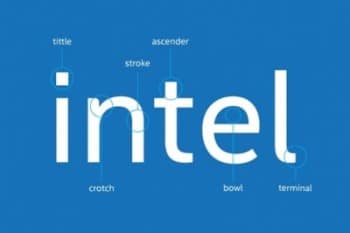
It’s interesting—sometimes, the choice between a cold, mechanical typeface and a warm, humanist one comes down to the tiniest detail in a single letter. That subtle curve in the ‘a,’ the gentler shape of a lowercase ‘e.’ These little things can really add up to shape how you feel about a brand, even if you’ve never consciously noticed them. Designers spend ages debating these characteristics, though to most of us, it just “feels right” or doesn’t. The public rarely sees these behind-the-scenes debates, but they’re definitely felt.
Luxury brands and banks choose serifs
Luxury brands, who rely mostly on selling physical goods like handbags and cars, rely on serif fonts more frequently than web-based brands. This is in part because serifs appear elegant and more easily readable in printed form, while sans serif fonts are better for reading on computer screens. Serifs also evoke the history of typography. Luxury brands use this to demonstrate their pedigree, and some banks incorporate serifs to prove their longevity and trustworthiness to consumers.
Consider investing in a custom typeface

There’s something a bit aspirational about seeing a company pour resources into custom typography. Maybe it’s the way it signals you’ve “arrived” as a brand—or at least, that you believe in your vision enough to chisel your own identity down to the kerning. Of course, plenty of startups will try hacking together something that vaguely resembles a bespoke font, usually for lack of budget. It almost never lands quite right. But when a custom typeface works, it becomes as much a part of a brand’s identity as its logo or slogan—think of Netflix or Airbnb, both of whom rolled out their own distinctive fonts in recent years.
It’s okay to be different
Despite the proliferation of sans-serif type, a few standout brands show you don’t have to follow the trend to be successful. Take Google’s logo for example, which uses Catull and is perhaps the only major web-based company to use an old style serif typeface in its primary branding. 
}}


