
Picture this.
Your click-through rate on your paid ads is high and you’re driving lots of traffic to your site from your email newsletter.
However, visitors aren’t converting into paid customers.
If you find yourself in this or a similar situation, it may be time to take another look at your product landing pages.
Creating great product landing pages is a key part of web design, and vital for increasing your product sales.
Do you want to know more about them? This is what we will cover:
Elements Every Product Landing Page Should Have
While every product landing page will be different based on your industry and business, there are a few elements every product landing page should include.
Great Customer Experience
If you want your visitors to transition from consideration to conversion, you need to make sure there are no obstacles preventing them from getting there.
For example, you should make sure your site loads quickly so users don’t get frustrated and leave.
You should also make sure your site looks as good on a mobile device as it does on a desktop. Finally, if you have any interactive elements, you should make sure they are working properly.
Well-written Copy
Your copy is where you really get to pitch your product to the potential customer.
You’ll want to make sure you explain the value of your product. Additionally, you should make it clear what makes your product different from similar products on the market.
This is called your Unique Selling Proposition (USP).
Depending on your product, it may also be a good idea to tell a story around your product. This can help add emotional value.
Lastly, be sure to include an enticing call to action (CTA). You’ll want to get creative with it.
“Add to Cart” is boring and doesn’t add anything to your pitch. On the other hand, something like “Start Your Free Trial” is much more likely to grab the user’s attention.
Social Proof
Social proof helps build trust with your potential customers and increases their sense of security when deciding if they should buy your product.
You can demonstrate social proof by including reviews, influencer or expert recommendations, or awards your product has won.
High-quality Images and Design
Be sure to include high-resolution images of your product that demonstrate its best features.
You should also make sure your landing page design fits your brand’s aesthetic and doesn’t overwhelm the user.
Keep the design simple and make the journey from consideration to purchase as easy as possible.
Finally, you may want to consider adding a video that showcases your product in action and how to use it.
5 Great Product Landing Page Examples
Now that you know why product landing pages are important and the essential elements they should all have, let’s explore some examples.
Here you’ll find inspiration so you can start designing your own product landing page.
1. Glyphfinder
![Product landing page example one: Glyphfinder]](https://mlgzkyrbq6eh.i.optimole.com/w:1024/h:781/q:mauto/https://pingback.com/br/resources/wp-content/uploads/2021/11/glyphfinder-1024x781.png)
Glyphfinder is an app that makes it easy to search for hard-to-find characters when typing.
One of the things that stands out about this landing page is the creative copy. The bold headline grabs the visitor’s attention, and right below is a clear explanation of the product and CTA.
While a navigation bar is often not included on landing pages, Glyphfinder actually included one. However, the navigation links point to different sections on the same page.
Also notice that two of the three links in the navigation are calls to action. This makes the transition from consideration to conversion as easy as possible for the user.
As soon as the user knows they want the product, they can simply click on the CTA in the navigation and convert immediately.
2. Privacy
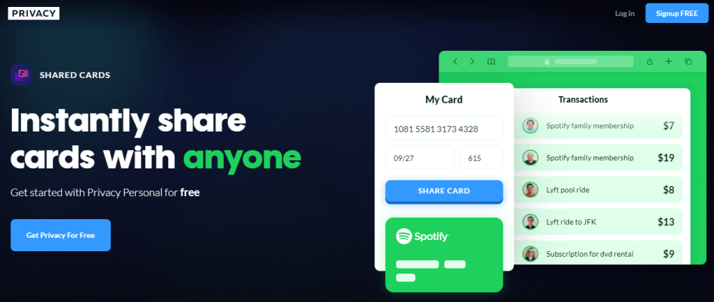
Privacy is a subscription service that allows you to share a credit or debit card with someone while including spending limits.
The bold headline immediately tells the visitor about the product, and the high-quality images on the right side of the page demonstrate how the product is used.
Another great thing about this example is the CTA.
“Get Privacy For Free” is very enticing for the users, and the link leads to a subscription choice page where the user can choose a free or paid plan depending on their needs.
The rest of the page has a simple design clearly outlining the product’s features and why the potential customer should use it.
Finally, they include their CTA multiple times throughout the page.
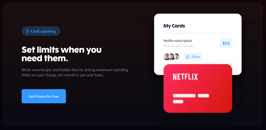
This is a great strategy because if the user decides at any point while scrolling the page that they’d like to convert to a customer, they always have a CTA available to click on.
This makes the journey from consideration to conversion much easier.
More companies are leaning toward minimal navigation these days, just because too many options can distract from the primary action you want a visitor to take. I’ve actually seen some brands experiment with hiding navigation altogether, forcing the user to stay focused on the page’s core message. But that can backfire if someone’s looking for more info and can’t find it—so honestly, it’s a bit of a balancing act.
Another thing worth noticing is how Privacy uses subtle accent colors for CTAs and important features. It’s not just about loud, flashy buttons; sometimes a gentle highlight or a bit of breathing room makes all the difference. You don’t want things to blend together, but also don’t want to shout at your users. This gentle encouragement can nudge people in the right direction without overwhelming them. It’s kind of like the difference between a salesperson who listens and one who just talks over you—subtlety really matters.
3. Toucan
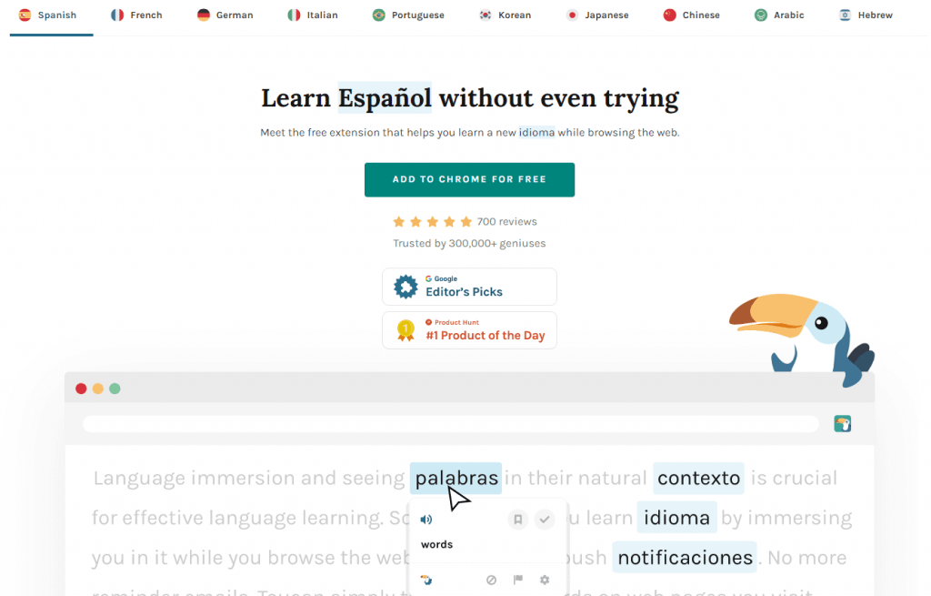
Toucan is a browser extension that helps you learn a new language as you surf the Internet.
One of the best things about this landing page is the use of social proof.
Not only do they have a great CTA, but they include their five-star rating and the number of people using their product.
They put even more effort into social proof further down the page.
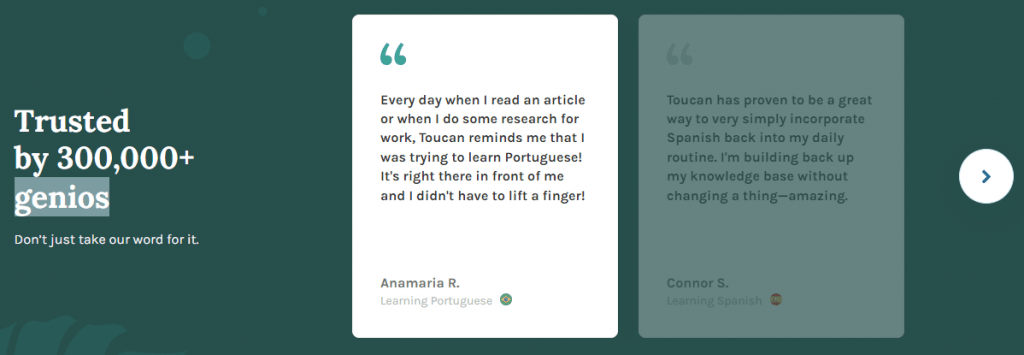
Not only does Toucan demonstrate that a lot of people trust their service, but they also use real reviews to develop even more trust with a potential customer.
4. GiftRocket
![Product landing page example 4: GiftRocket]](https://mlgzkyrbq6eh.i.optimole.com/w:1024/h:471/q:mauto/https://pingback.com/br/resources/wp-content/uploads/2021/11/giftrocket-1024x471.png)
GiftRocket offers customers a way to send money to someone while giving them more flexibility than a traditional gift card.
The landing page is clean and simple with a clear CTA.
They also incorporate social proof by mentioning the major publications the company has been featured in.
Further down the page, the landing page presents different card designs to send with the money.
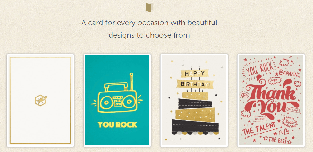
These clickable card designs function as another CTA. By clicking on one of the card designs, a user goes through to the purchase page.
This is a clever CTA design that doesn’t even require any copy.
5. Hypnax
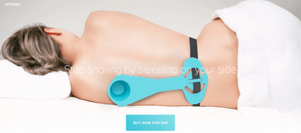
Hypnax is a device that prevents you from sleeping on your back to prevent snoring.
One of the best things about this landing page is the crisp, high-resolution images of the product.
In the copy, they clearly define the value of the product to the customer next to the images.
Finally, they include an FAQ at the bottom of the page to answer any concerns a potential buyer might have before purchasing the product.
Wrap Up
Remember that your product landing page is your pitch to your potential customer. So a high-quality product landing page can make or break your conversion rate.
However, there’s a lot more to know about landing pages that we haven’t covered in this post.
To learn more, check out our guide on how to choose the right type of landing page!
}}
