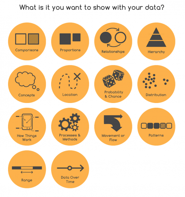
If you’ve ever struggled with what visualization to create to best show the data you have, The Data Visualization Catalogue might provide just the help you need. 

What I find particularly helpful is how the catalog doesn’t assume you already know what you want—sometimes you just want to browse and let the visuals prompt new ideas. Maybe you’re staring at a spreadsheet full of percentages and single numbers and thinking, “Alright, but is this a bar chart, or can I get away with something a bit jazzier?” With the catalog laid out the way it is, you don’t have to make that call on gut feeling alone. It prompts a sort of curiosity, letting you jump in from the question you’re trying to answer, instead of picking blindly from a parade of odd-sounding chart names. Anyway, speaking from experience, a tool that takes some of the anxiety out of these decisions can be a game-changer for folks who don’t necessarily have a background in design but still need their work to look half-decent (or at the very least, clear).
It’s also kind of surprising how much overlap there can be between different types of charts, depending on your data and the story you’re hunting for. I’ve seen people modify scatterplots to act like heatmaps or turn basic tables into something that almost resembles infographics, all because the dataset started pulling them in a new direction mid-way. Sometimes the classic choices, like line graphs or pies, just don’t have the oomph you need—or maybe they confuse more than they clarify. When that happens, having a space where you can quickly check alternatives saves time (and, let’s be honest, your credibility in meetings).
Tableau has a similar tool (Show Me) embedded into their software, but a free tool that lets the user specify the data properties and get a list of options is a welcome development. We hope the tool continues to develop and has more visualization types added quickly! With questions, comments or simply encouragement for the project, you can get in touch with Ribecca via Twitter: @dataviz_catalog. Drew Skau is Visualization Architect at Visual.ly and a PhD Computer Science Visualization student at UNCC with an undergraduate degree in Architecture. You can follow him on Twitter @SeeingStructure
}}


